While I have attached a framework to receive the idea of writing articles on demand, there are 7% of the writing requests related to the website interface displayed in Responsive format. From there, I realize that there are many readers here who still do not know how a website interface can display Responsive, so in this article I will explain and guide you to apply Responsive to your website. yourself.
Knowledge required
In this article I only talked through Responsive so the basic knowledge I will not talk through, so you need to prepare basic HTML and CSS knowledge to be able to fully understand.
What is responsive?
Responsive is an adjective that indicates a website can be displayed compatible on all display sizes of the browser. For example, if the website interface is set to a fixed width of 800px then surely if viewed in a phone browser with a width of only 320px - 420px will not display all.
You may think that we can assign the width value from absolute (800px) to the relative value type as a percentage (%), so that it will display accordingly. This is also true, but assuming your website has 3 columns in a row, is it possible for a human eye to see the details in a mobile browser without enlarging the screen? Therefore, we will want the interface to be displayed a little differently on browsers smaller than conventional browsers, and Responsive is the solution to do this the fastest and easiest.
Responsive works by how we will write CSS so that the browser understands and executes it on certain browser sizes. For example, you can set a piece of CSS that only applies to browsers with a maximum width of 320px (phone). This means that Responsive is a design technique that is processed from the client-side and does not send any queries to the server for processing (server-side), so it has one drawback is that your browser must It takes more time to process the CSS.
So how to apply Responsive to the website interface?
In order for your website to become Responsive, we have two steps as follows:
Step 1. Declare viewport meta
First you need to put this tag in the <head> pair above in the HTML of the website.
01
| <meta name="viewport" content="width=device-width, initial-scale=1"> |
meta viewport means a setting tag for the browser to display the corresponding screen size. For example, the above example means that you will set the browser to display fixed and corresponding on all devices based on the device width (device-width) and do not allow users to zoom in ( Initial-scale setting with fixed value of 1). This is the card I encourage you to use for all Responsive projects.
In addition, this meta viewport tag also has values such as:
- width : set the width of the viewport.
- device-width : Fixed width of the device.
- height : set the height of the viewport.
- device-height : Fixed height of the device.
- initial-scale : Set the initial zoom level, a value of 1 means no zoom, and when the value is set, the user cannot zoom because it has been fixed.
- minimum-scale : The minimum zoom level of the device for the browser.
- maximum-scale : The maximum zoom level of the device with the browser.
- user-scalable : Allows users to zoom in, the value is yes or no.
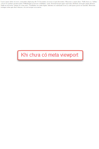
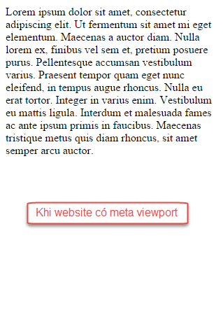
Why use meta viewport? Let's take a look at an example of content with meta viewport and no meta viewport.
Step 2. Write the CSS for device width
Right at this step, we will proceed to write the corresponding CSS for each width or height of the device, usually we only write based on width and calculated in units of pixels. Many people can calculate based on the unit is em, rem, DPI, percentage, ... but if you are new, just use the pixel for easy offline.
To write the corresponding CSS for the width of the browser, we will use the query tag
@mediain CSS3 (@media query) as follows:
01
02
03
04
05
06
07
08
09
10
| body { background: #fff; color: 333;}@media all and (max-width: 320px) { body { background: #e7e7e7; }} |
This means that your website will have a white background by default, but when it shrinks to 0px to 320px, it will have a gray background with # e7e7e7 color code.
In the above paragraph, the paragraph
@media all and (max-width: 320px)means to set a breakpoint for the entire device (all - media type) and has a maximum fixed width of 320px (max-width - media features), 320px corresponding to the width of the screen. iPhone picture. And the CSS inside this query will be executed when the browser window is correct with sizes from 320px and below.
In addition, you can also set more conditions such as:
01
| @media only screen and (min-width: 320px) and (max-width: 860px) {...} |
That is, this query will only apply to desktop screens, tablets, smartphones and has a minimum screen size of 320px but smaller than 860px.
Regarding the values of media type and media features in @media query, you can refer to W3Schools for more complete but usually we just write CSS for media types as screen and media features only around min-width, max -width only.
How to test Responsive?
When working, you can test Responsive by manually scaling the browser, but it's not "smart". But I would encourage you to use the support tools to check, one of my favorite Responsive testing tools is Resizer , very easy to use and compact. See the usage below:
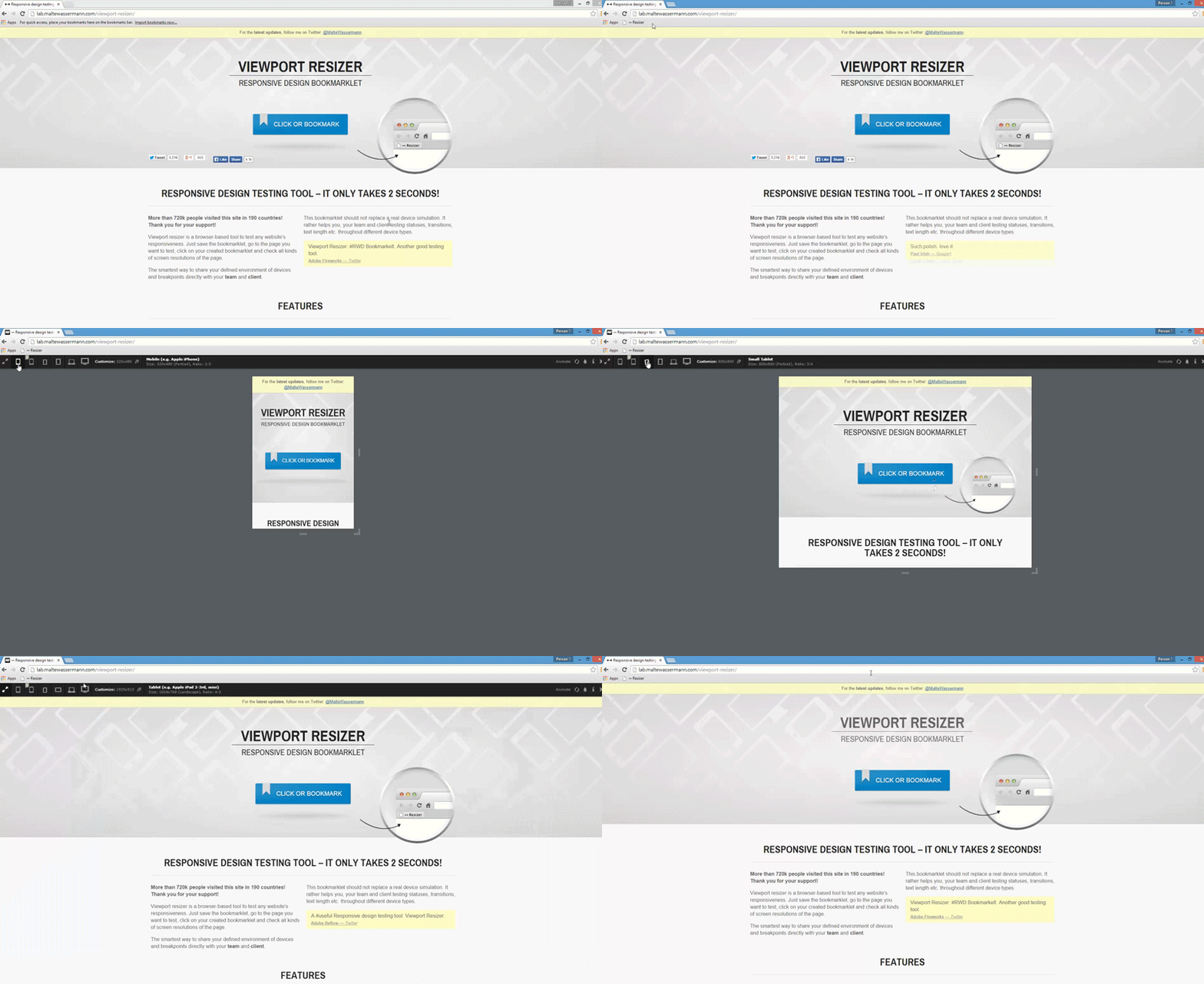
List of device screen sizes
When writing CSS for Responsive interface, the most important thing is that you must understand the screen size of common phones to be able to write CSS as you like and make sure it works well on many devices, especially common devices.
You can refer to the width sizes of the devices here , but for most projects you just need to create CSS breakpoints as follows:
max-width: 320px(mobile phone, vertical display)max-width: 480px(mobile phone, horizontal display)max-width: 600px(tablet, vertical display)max-width: 800px(tablet, horizontal display)max-width: 768px(large tablet, vertically displayed)max-width: 1024px(large tablet, display horizontally)min-width: 1025px(from this size upwards is the regular desktop name).
Example CSS structure of a common Responsive interface
01
02
03
04
05
06
07
08
09
10
11
12
13
14
15
| /* Các CSS này dành cho toàn bộ website và desktop */body { background: #fff; color: 333;}/* Dành cho điện thoại */@media all and (max-width: 480px) {}/* Dành cho máy tính bảng */@media all and (max-width: 1024px) {} |
Mobile-First concept
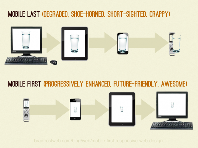
When talking about making Responsive interface, you also need to know through Mobile-first concept because it will help the process of making your Responsive interface a lot faster. Mobile-first means the name of a design process that we will start designing for the interface on the phone first and use the phone as the initial platform, then go to other devices such as tablets, desktop, retina, ...
The feature of the mobile-first process is that we only use media features as min-width and not anything else. I have the following example:
01
02
03
04
05
06
| @media all and (min-width: 320px) {body { background: #e7e7e7; color: #333333;}} |
This means that devices with a minimum width of 320px will apply the CSS inside, of course it will also include the interface of tablets, desktops, etc.
And when using the mobile-first process, your CSS will have this structure:
01
02
03
04
05
06
07
08
09
10
11
| /* Dành cho điện thoại */@media all and (min-width: 320px) {...<span style="line-height: 1.5;">}</span>/* Dành cho máy tính bảng chiều dọc */@media all and (min-width: 600px) {...}/* Dành cho máy tính bảng chiều ngang */@media all and (min-width: 1024px) {...}/* Dành cho màn hình desktop */@media all and (min-width: 1280px) {...} |
So why use mobile-first? There are many reasons such as:
- Maximize your focus on the look and feel of your phone because of the increasing trend in phone usage.
- Avoid rewriting CSS, because a phone CSS can be reused on the desktop. But if you write CSS on the desktop first, then in the phone interface you still have to rewrite if you want to customize.
- Easy to deploy and manage, upgrade later.
- Avoid display errors on your phone due to customization from your desktop CSS.
- And many other reasons that only when new know.
Some knowledge to know when writing Responsive CSS
- In addition to the px unit of breakpoint, the unit of length measurement in the website should be a percentage. Or rather, use relative units .
- Should be used
max-widthinsteadwidthto avoid fixed width. - Use display: none for the components that need to be hidden in each device that you want to hide. And display: block in devices that need to be displayed.
- Use the! Important option if you need to override CSS.
Basically that's just that, actually Responsive is only the most stressful menu making but when practicing you will understand more details.
Epilogue
In this article I have detailed the concept of Responsive and how to implement a Responsive interface is like. Now you can practice by creating a simple HTML file, declaring a meta viewport tag, and then trying to write a CSS to get a better idea of how it works.
Hopefully in the future, I will have a tutorial on making a complete Responsive HTML website interface for you to practice on your own. And once you have learned how to make a Responsive interface, then creating a WordPress theme that supports Responsive is no longer too difficult. Everything will be presented slowly.




Post a Comment
Post a Comment